Hello Class!
Research has shown time and time again that colors have a drastic impact on our subconscious – they can make our heart rates speed up or calm down, simply by being painted on the walls of a room we’re entering.
Colors can have a different effect on us depending on our culture and countries of origin. While red is considered a color that symbolizes fertility and luck in certain parts of Asia, it was regarded as a negative and fear-inducing color in ancient Europe. In fact, certain scholars believe that during the dark ages, some torture rooms featured red walls to strike fear into the hearts of prisoners!
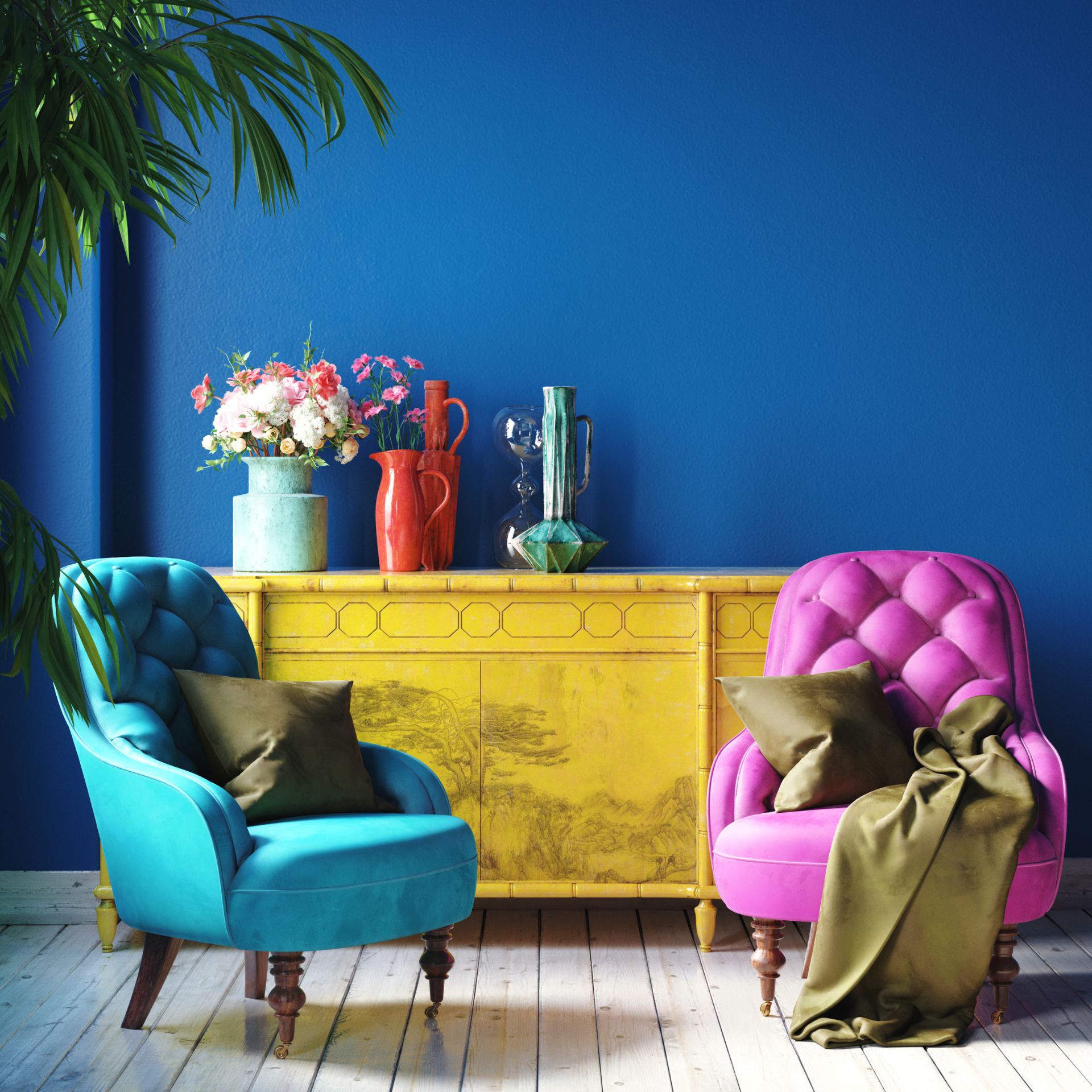
Interior design utilizes color psychology to create a specific atmosphere and mood inside a room. You can invoke basic emotional responses in people with carefully chosen colors and hues!
Creating a well-balanced color palette for a room, then, is quite a task for every Redecorator. There are many things to consider, like what atmosphere you’d like to create and what culture your clients are from.
Here are a few basic thoughts on colors and what they’re associated with in modern Western culture:
- Red – This warm color can evoke energy and invigoration if used correctly (mainly as an accent color in textiles or furniture), as using too much of it in a small place may create an overwhelming feeling.
- Yellow – While yellow is linked with happiness and optimism, but it should be used sparingly and in the correct tone. A yellow that’s too bright can spark feelings of agitation, and a yellow that’s too pale can actually make one feel ill.
- Blue – A cooler shade of blue is believed to promote serenity and calmness. Darker blues are recommended for spaces that require a lot of focus, like home offices or study rooms.
- Black – Black can cause an intimidating atmosphere if there’s too much of it around the space, but when used precisely it’s a great way to highlight elegance and sophistication. With black, it’s important to choose the correct complementary colors, as it easily becomes overwhelming.
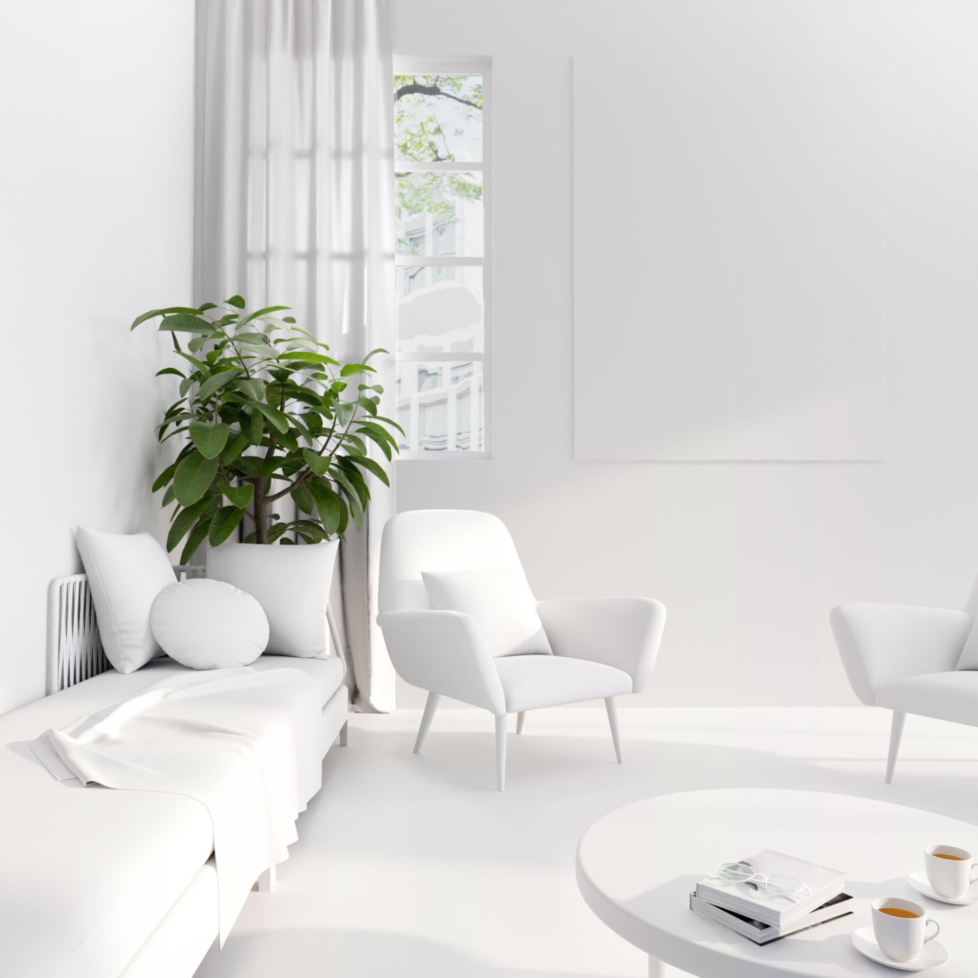
- White – White is a great way to open up a space that previously felt crowded. It pairs well with most colors and is one of the ingredients of a classic design. Many people connote white with feeling refreshed and cleansed.
Color phycology
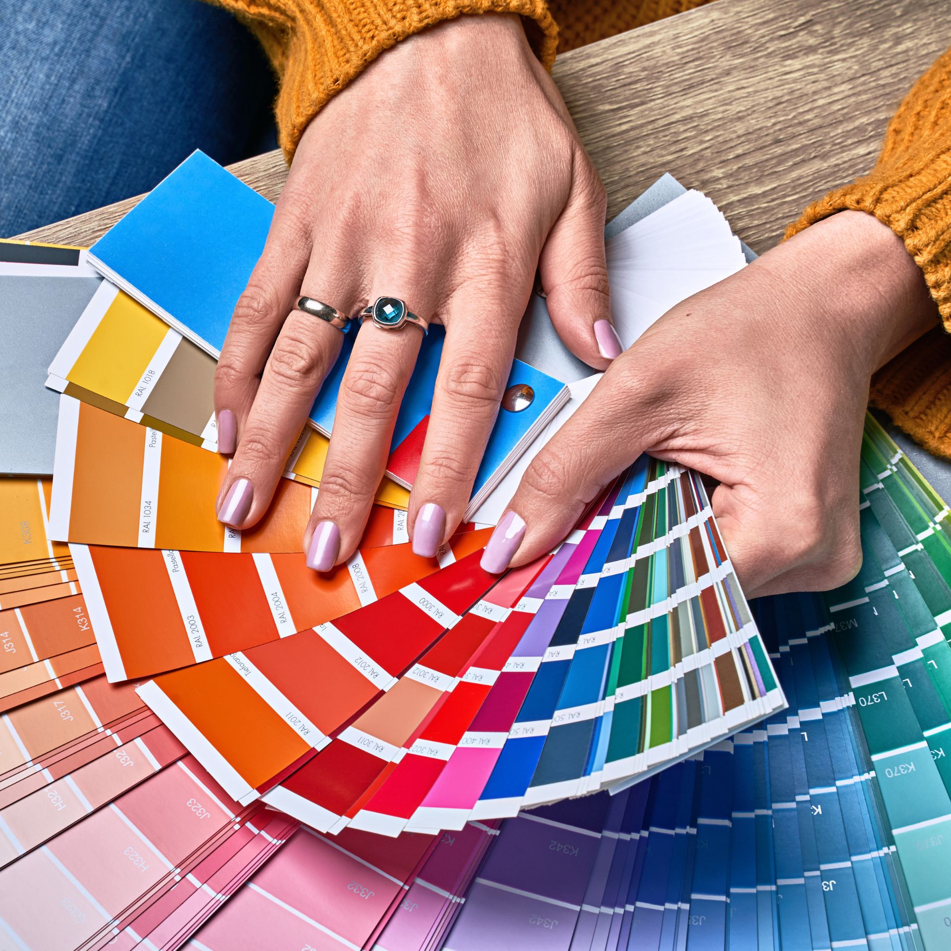
Basic terms when it comes to colors:
Every master was once a beginner! Here’s a bit more information about the different phrases we’ve been throwing around this lesson.
- Tint – a basic hue with varying degrees of white. In this way, a vibrant purple can turn into a pastel lavender. That would be a tint!
- Shade – much like a tint, shade is what you get when adding black to a color to make it deeper and darkened.
- Tone – When grey is added to a hue to create a tone. This helps decrease the vibrancy of a color that is much too bright into a softer, more palatable hue that we can use.
- Value – how much light a specific color has. The lighter the color, the higher the value! For a more harmonious contrast, look to incorporate colors with different values in your design.

Psychologist office
Today’s task: Create a calm and relaxing space
What kind of colors, textures and patterns would you use, if the client wants you to design a calm and relaxing room?
Think of the different emotional effects colors can have on a person, and then choose the exact tint and tones of the colors you’d like. Knowing what you already know about lighting, which light fixtures would you choose to create a calmer mood?
Homework:
Analyze how you feel in places that have really calm versus really colorful interiors.
What colors are often used in gyms and other sport-related areas, spas, and hospitals?
What did the interior designer want to induce with those color choices?
You can also ask yourself easier questions like, what is your favorite color, what it reminds you of, and how it makes you feel.
Practice makes perfect:
Practice today’s lesson on the Season Pass challenge, “Lesson 4”, going live on September 10th at 6:00 PM UTC