Ready to be inspired, Redecorators?!
Welcome to the latest Redecor Season – Eclectic Pride! Woohoo! Life is a party, and we’re calling all you lovely Redecorators on board the party train with us! Post-modern designs with an eclectic twist are right around the corner, reminding us all to take ourselves lightly and to just have fun, no matter what it is we’re doing.
Our artists created these gorgeous rooms to show you how to mix and match all of this Season’s stunning materials. Dive into a world of color and fun with these great designs!
But first, here’s a little bit on HOW to get your hands on this beautiful new Collection – with the Season Pass, of course.
What is a Season Pass?
Every month Redecor welcomes a new Season! Each Season has a special theme – and new & unique rewards – cash, gold, and, of course, special design materials that aren’t available anywhere else! These rewards are accessible only through the Season Pass, which is available for purchase on the app all month long.
What are the Season Pass’ unique materials?
Each Season has its own special Collection that incorporates the Season’s style. This Collection can be varied and include a number of unique design items such as wall art, wallpaper, throws, rugs, and upholstery. After the Season ends, there’s no way to get these exclusive materials! The only way to get them is to purchase the Season Pass while the Season is still running.
How do I get the Season pass?
Simply click on the star icon on the right side of the screen on your Redecor app! For the price of a cup of coffee, you get a monthly dose of design fun! The Season Pass does not renew itself, so remember to get it yourself each month – there will be no recurring billing or hidden costs.
Now that we’ve discussed the technicalities… Let’s get started with the fun design aspect!
About the Inspiration Catalog…
Never dabbled much in post-modern designs? Not too sure what “eclectic” really means? We’ve got your back. In order to highlight each design item you’ll be getting with the Season Pass as they come, our artists have put together these carefully styled rooms to show you that blending colors and patterns don’t have to be scary! It can be beautiful, stylish and full of chic.
This Season, we’ll be welcoming in our retro roots in true 80s hippie fashion! Here’s how to create a fun and cheerful atmosphere, without falling into the dreaded kitsch traps associated with the post-modern style. Ready? Let’s go!
1. Restful Pastel Perfection
Notice how this lounging area is full of color – but you don’t feel overwhelmed! Why is that? Well, let’s give a standing ovation to everyone’s favorite color palette – pastels! Pastels are a wonderful way to add color, and lots of it, without overwhelming the senses. This room doesn’t feel childish or overpowering in any way, in fact, the pops of color fit in just right.
![]()
The wallpaper behind the sofa is a paler shade of blue to allow the bolder colors of the pillow to pop out undisturbed. The “Eclectic Basket” pillow goes hand in hand with the “Dainty Flowers” vase pattern, both in colors and shapes. Notice how the more colorful pillow is placed front and center to capture the eye, while the “calmer” colors linger in the background to add a nice touch that supports it. The side table is another great pop of color, turquoise this time, with the lovely “Freedom” tiles.
All in all, a wonderful, calming room – that’s also incredibly cheerful and happy!
2. Rainbow Reading Corner
Don’t you just want to plop down on this chair and pick a book?! With such a colorful reading corner, you can bet the books awaiting you are just as interesting!
Once again we can see how the calmer background allows for the other colorful pieces in the front of the room to take all the attention with ease. Book covers naturally come in all kinds of shades and colors, which can often be frustrating when designing reading nooks and corners incorporating bookshelves. How can you decide on one primary color palette when so many different colors are added smack down in the middle of it?! That’s the beauty of eclectic designs – you don’t have to choose just one! All colors are welcome with ease, it’s all about smart placement.
![]()
The beautiful picture, “Love is Love” starts off the rainbow trend that’ll be prominent throughout this room. Next, we can see the lovely striped pattern on the sofa, showcasing all those curvy lines we mentioned in the Style Guide! It’s paired with the classical “Eclectic Pride” pillow and “Sweet Berries” vase.
Notice how the Vase, the picture background and the carpet all have different shades of pink, tying them all together cohesively. This makes the corner not appear “too” matchy-matchy, but also not too distant from a coherent color palette. On the same basis, the cabinet and corner chair have similar shades of greenish-blue as well as the pillow.
Now do you see what we meant when we said “smart use of colors”? All of this might seem accidental to the uneducated eye, but it’s part of the job of a good Redecorator to notice these details!
3. Let’s Go Bolder!
Had enough of soft pastels? Want to create something with an extra kick? Here’s how to do it right! This time we’re taking a lesson from the color wheel (you can check out Aydan’s lovely video about that on the Redecor YouTube channel if you’d like ) and setting up colors that match nicely together. That’s the reason behind the bright yellow background paired with the darker burgundy couch! Both are eye-catching for sure, but can coexist in peace side by side.
![]()
Notice how the footstool is the only one with a prominent pattern. We don’t want to overdo it! With a pattern as bold as this one, it’s best to let it have the floor and focus on color rather than adding in more textures and patterns with the rest of the room.
The lovely picture we see hanging up on the wall (“Stronger Together”) is another take on burgundy-purple, a lighter shade, admittedly, but one that works well together with both the yellow wall and the couch.
The checkered pattern is referenced again in both the second picture and the vases, tying in these elements together to the footstool so that your eye can shift comfortably from checkered picture to checkered vase to checkered stool. The same can be said about the “Stronger Together” picture – the eye follows the purple shades from picture to sofa to pillow with ease.
The tiled floor adds a slightly industrial feel, bringing this whole post-modern room out of the 80s and into the 2020s!
4. E-girl Dressing Corner
E-girls is a term referring to “internet girls”, those who live online and in the fabulous swipes of social media. They’re the girls who know how to post just the right picture to get thousands of likes – and can often be spotted sharing a “Get ready with me” video showcasing their amazing dressing corner!
You’ve got to admit, this corner is indeed “E-girl” worthy! The curvy waves are making an appearance once again with that retro mirror design, but are brought back to date by the fun and light pastel yellow (“Burst of Yellow”). Bringing the sunshine into your own house doesn’t have to be a chore, as this lovely mirror proves!
![]()
Of course, no true “E-girl” would be caught without a beautiful bouquet of flowers, placed in an even more gorgeous vase! This sweet pattern (“Dainty Flowers”) is just retro enough to give off “cutesy but effortless” vibes without pushing the whole scene into the fearsome realm of immaturity.
The busy wallpaper with heart prints is a sweet addition, adding to the lightheartedness of the design – and also promoting a prominent pink element which is also reflected in the vase, pillow and rug. Notice how the room “speaks” the same sort of tones and shades, whether it be in the clothes, the knickknacks or the flooring chosen. That’s what you’re aiming for when designing a colorful and pattern-filled room – for it to have a similar color palette so as to not seem too jarring. A great rule of thumb is to pick 3 main colors and base your design on their shades! Here you can see yellow, pink and turquoise, all in different textures shades and tones. Would you get ready there? We know we would!
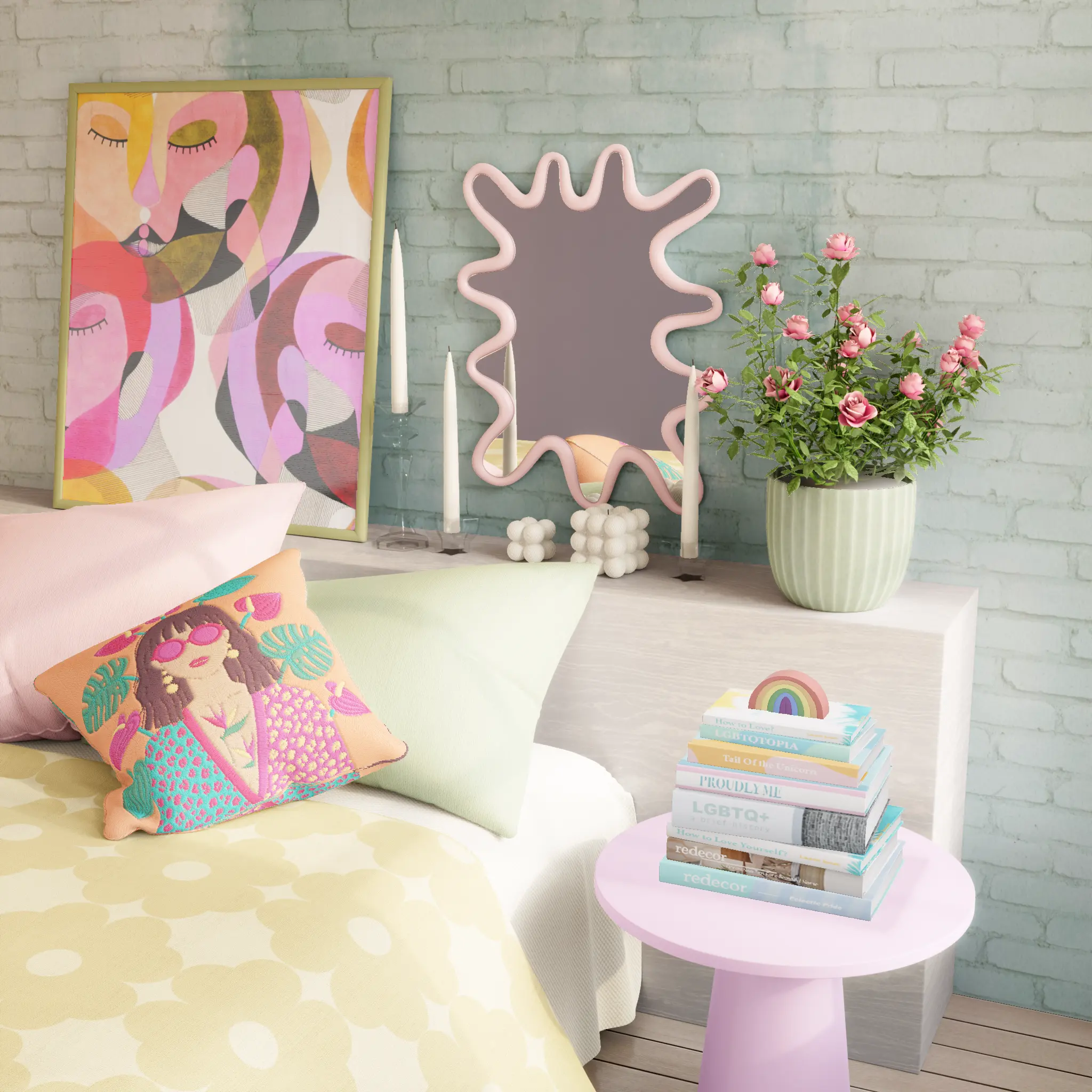
5. Calling All Cool Cats
Feeling cool? As you should! Now, how do you reflect that in your designs? The post-modern aesthetic is a great outlet for creativity, and an even greater way to let your uniqueness shine. Is it too busy for some? Is it too colorful? Great! You don’t care! If YOU like it, then that’s all that matters. This is what Eclectic Pride has come to remind us all of – owning your own style, no matter what anybody else has to say.
Starting with a calmer background of relatively neutral bricks, you can add color and knickknacks that make you feel happy, like a funky mirror and a colorful art piece! In this example, our artists chose the same tones for the mirror frame and the picture to help the two mesh together well. They continued the pink-purplish tones around the room with 2 of the pillows and the nightstand.
![]()
Another color we can see repeated in this room with various shades is the ever-happy yellow, with the pillow, bed covers and flower pot. Notice how that calm grey-greenish background of the bricks fits the pillow background perfectly so it is referenced here as well. Once again, nothing is accidental! All of the different shades work together to tie the whole scene wonderfully.
The “three-color rule” from the previous paragraph fits perfectly in this room, don’t you think, Redecorators?